Style Guide
Logos
The Wallen-Douglas Digital logo features a sleek design with a dark blue background. It consists of a white capital letter “D,” representing “Douglas,” with a white capital letter “W” enclosed within it to symbolize “Wallen.” The integration of the two initials showcases collaboration and partnership. The high contrast between the white letters and dark blue background creates a professional and trustworthy impression, representing the modern and collaborative essence of Wallen-Douglas Digital.
Colors
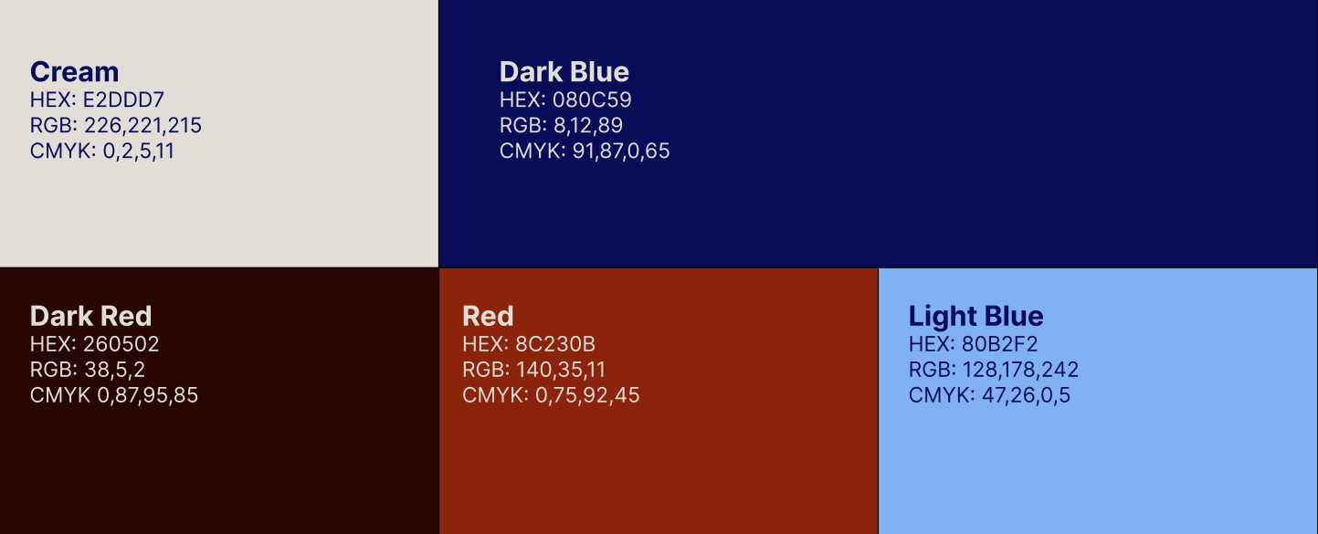
In the color section of the Wallen-Douglas Digital style guide, the palette is defined by the following hex codes:
- E2DDD7: This soft, warm shade of off-white, reminiscent of light cream, adds a touch of elegance and sophistication. It can be used as a background color or for subtle accents and fonts throughout the brand materials.
- 080C59: A deep, rich navy blue, this color exudes professionalism and stability. It serves as a primary brand color, conveying trust and reliability. It can create a strong visual impact for headings, fonts, backgrounds, or other prominent elements.
- 260502: This dark, intense dark red color provides depth and contrast. It can be used sparingly for text, borders, or backgrounds to add emphasis and create a sense of refinement.
- 8C230B: A vibrant and warm shade of vibrant red, this color adds a pop of energy and excitement. It can be used as an accent color to draw attention to specific elements or convey creativity and enthusiasm.
- 80B2F2: A refreshing and bright sky blue, this color evokes a feeling of optimism and openness. It can be used as a secondary brand color for backgrounds, icons, or other design elements to bring a sense of calmness and approachability.
This color palette reflects the essence of Wallen-Douglas Digital, combining a sophisticated navy blue with soft neutrals, deep blacks for contrast, and pops of vibrant red and calming sky blue to create a visually appealing and cohesive brand identity.
Colors- Accessibility
While these colors are chosen for their aesthetic appeal, we also prioritize digital color accessibility. Following the Web Content Accessibility Guidelines (WCAG), we ensure that there is sufficient contrast between text and background colors, enabling legibility for users with visual impairments. By maintaining accessible color combinations, we promote inclusivity and a positive user experience across our brand materials.
Typography
Typography – Heirarchy & Usage
Photography
In the photography section of the Wallen-Douglas Digital website, we strive to create a visually captivating and cohesive visual narrative that showcases the essence of our brand. Our art direction emphasizes high-quality imagery, consistency, authenticity, and inclusivity. Through strategic branding elements, creative perspectives, and attention to lighting and composition, we effectively communicate our expertise in the digital realm. Additionally, we feature product views to highlight the tangible aspects of our offerings and provide examples of our work. This combination of elements creates an engaging and immersive experience for our audience, allowing them to connect with our brand and witness the real impact of our services
.


